More than 50% of visitors from mobile
Research has now shown than more than 50% of visitors come from mobile. This is to be expected especially when we heard last year from several Google workers that mobile has already taken over desktop searches in 2015. With such a trend and probably more to come in the upcoming decade, it is all the more important to pay attention to your mobile friendly website.
The misconception of a mobile friendly website is common and people have the impression that as long as their website can be view online, it is automatically called a mobile friendly version. This can be further from the truth.
There are 4 key features of a mobile friendly website:
Visible and touch friendly call to actions
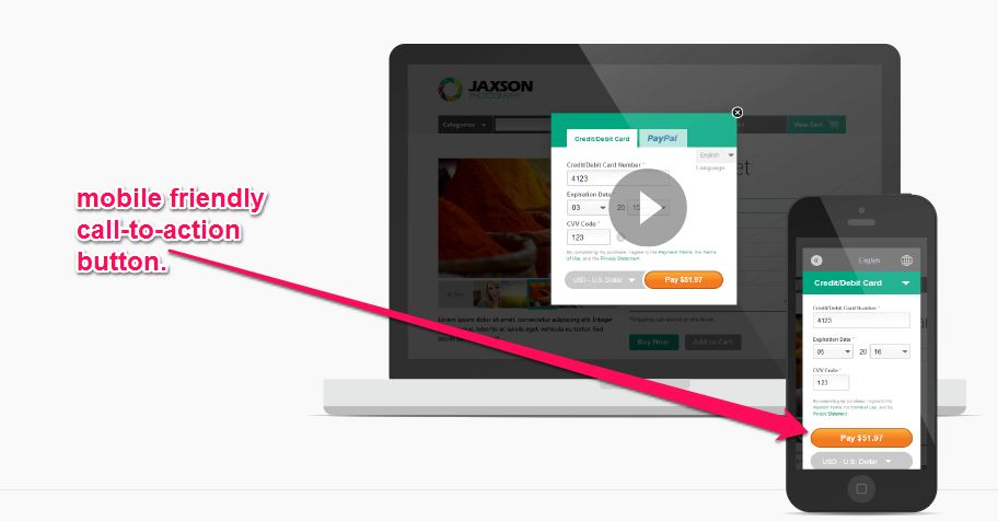
visible call to actions is definitely needed for mobile-friendly sites in order to convert. Where a desktop will excel in precise clicking and can easily navigate through a page, mobile devices are tiny and in comparison, require a visible button or call to action in order to convert sales.
Call functionality
statistics have proven that conversions occur within 3 minutes of navigating of a site and also that visitors often at times are just looking for a number to call easier to make the purchase. It is essential that your number is thus visible throughout the website and has the code to automatically bring the visitor to the dialer at a single tap.
Simple Navigation

Navigation can be really tricky if your website is not mobile friendly. The need to scroll to the left or right in order to reach a page is frustrating. Websites should have simple navigations with a large font which makes it touch friendly. Structuring your website to allow visitors to reach where they want to within 3 clicks is also a huge bonus
Scale according to size

If the war between Android and Apple is anything, you’ll know that screen sizes vary greatly within different brands. mobile websites should be able to scale perfectly according to any size you throw at the visitor be it tablets or mobile phone. Your pictures and navigation should also scale accordingly to give visitors a unified look throughout the board.
Conclusion
With the uprising of mobile searches, mobile sites are a definite must for any website to succeed. In addition, speed is also a key factor especially when your mobile device has significantly slower internet speeds than your wired or home connection. It is also important to conduct separate tracking for both your website and mobile view so that you can determine what works for your website. Check out this article if you would like to find out how to make your website load faster.

Leave a Reply
Want to join the discussion?Feel free to contribute!